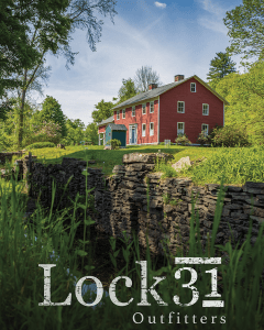
“Lock 31? That’s an unusual name for a store.”
I distinctly remember saying those exact words when I first learned of our task to brand it from the ground up. I quickly learned that it was not a lock in the sense that originally sprang to my mind – not a padlock, or a lock on a door, or one of those cute little locks symbolizing love that people leave behind on that one bridge in France. Turns out, a lock is a mechanism used in canals, and Lock 31 happens to be the most well-known remnant of this vestige of transit that connected much of our area.
Before we could begin to conceptualize how this brand would look and feel, we had to dive head first into researching the significance of Lock 31 and the importance of the canal to our region.
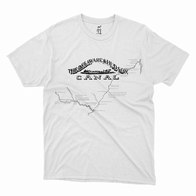
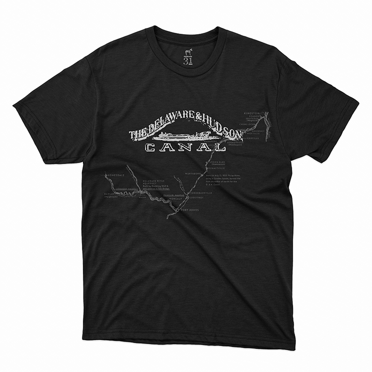
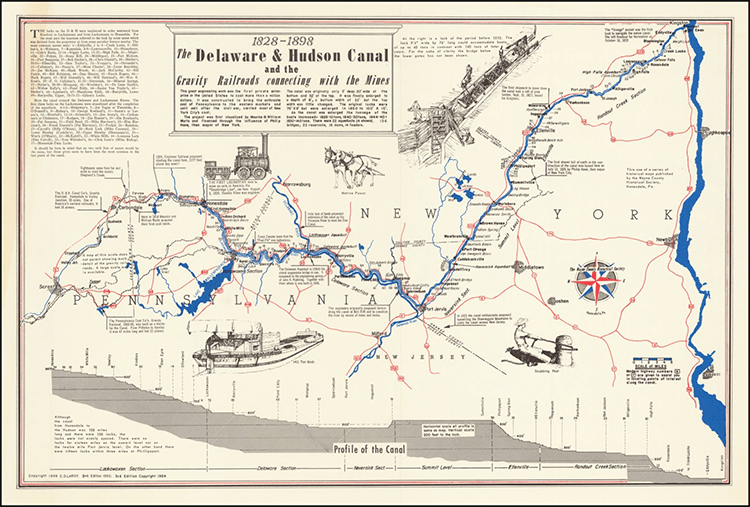
William and Maurice Wurts built the Delaware & Hudson Canal as a way to transport anthracite coal from Northeast Pennsylvania to New York City on the Hudson and Delaware Rivers. Coal was loaded onto the boats in Honesdale where it departed for Kingston, NY. Towns along the route, including Honesdale, owe their major development to the shipping of coal.
The 108-lock waterway operated from 1828 and 1898 until the D&H canal was no longer a practical means of transportation. In 1898, the last coal boat made the trip from Honesdale to Kingston. After this, the canal was closed and drained.
A lock is a device that is used for raising and lowering ships and boats on a waterway for ease of navigating different water levels. There were 108 locks on the D&H Canal. Today, Lock 31 is a historic site in Honesdale: home of the Lock 31 House.
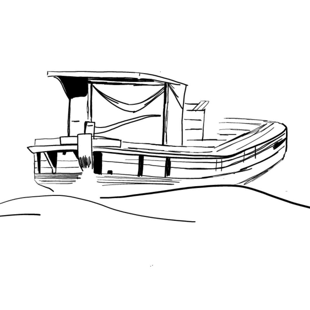
We knew right away that we wanted the store to have an icon that could be separated from the logotype and used on its own. A boat seemed like an obvious choice, but perhaps a little too obvious. A lock, while definitely unique, was hard to recognize, especially for those unfamiliar with the term. We kept brainstorming, trying out things like compasses, abstract water, and variations on 31, until we landed on a mule. As an integral part of the canal system, a mule had the makings of a recognizable icon that could be emblazoned everywhere from social media to aluminum water bottles.
So we found ourselves with a final brand – blessed by the client, exported in every format that matters, and organized in neat little folders. Cool. Now what?
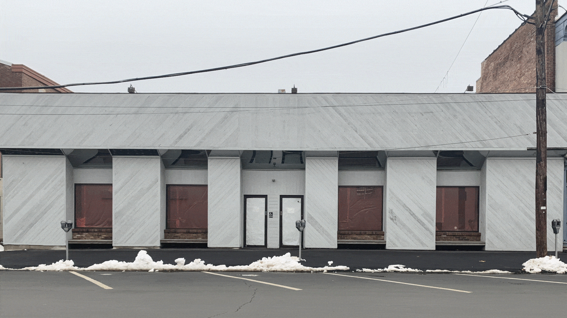
First things first, we started with the exterior of the building.
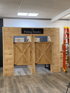
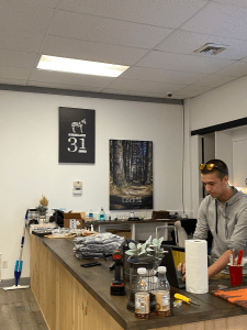
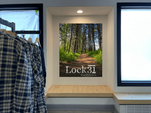
Once the exterior was finished, we focused on interior designs followed by new merchandise. We can’t wait to see where the future takes our friends at Lock 31.