When we dive into developing a new brand, we’re always looking to the world around us for inspiration. Oftentimes, that ends up reflecting the current logo trends that other designers are experimenting with from around the world. Different businesses have different desires to be “trendy” versus more classic. No matter what, we always like to present a more modern option that brings a brand idea into the current times and feels fresh.
Sometimes, we may find that our own ideas are on the cusp of a new logo trend – enter the 2022 Logo Trend Report. Halfway through each calendar year, the folks at Logolounge release a summary of the biggest trends they see emerging. They predict what trends will establish themselves throughout the remainder of the year. Not only do we look to this list for inspiration, but it also helps confirm that some of our own ideas really are on the cutting edge of design. 😉
How many logo trends did we nail so far this year?
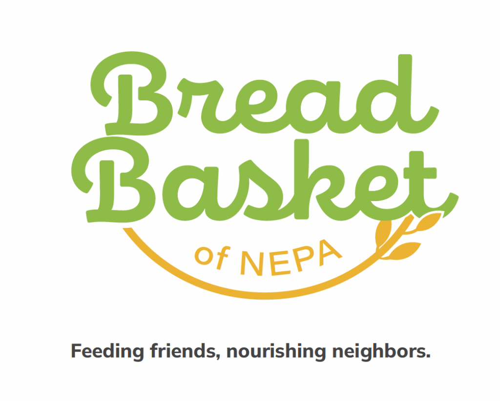
Let’s take a look at one of our favorite recent branding projects from earlier this year. Say hello to Bread Basket of NEPA.
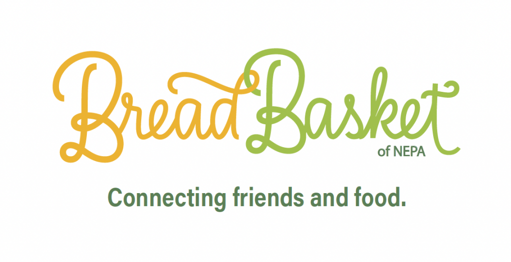
We had a ton of fun exploring what this brand could look and feel like. With the input and feedback from the wonderful folks on their board we were able to present a final brand that truly embodies what they do. This logo embodies their passion for providing food for the community while feeling fresh, modern, and inviting.
Before we arrived at this logo, however, we had a multitude of options exploring what this brand could feel like. We always love how the final logo turns out. However, we have a soft spot for the “ideas the could be” that are left on the cutting room floor.
Check out some of our alternate ideas in terms of where the 2022 Logo Trends are going:
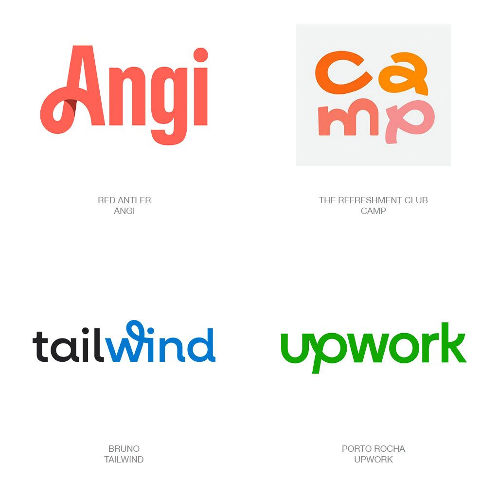
Trend: Loopers
“In an ambiguous reaction, this year’s collection of wordmarks are stilted with abundant sans serif solutions to stay on the safe side but with an insertion of whimsy or a visual gesture of self-defiance like a humorless MBA attempting to demonstrate spontaneity.”
Our Take:
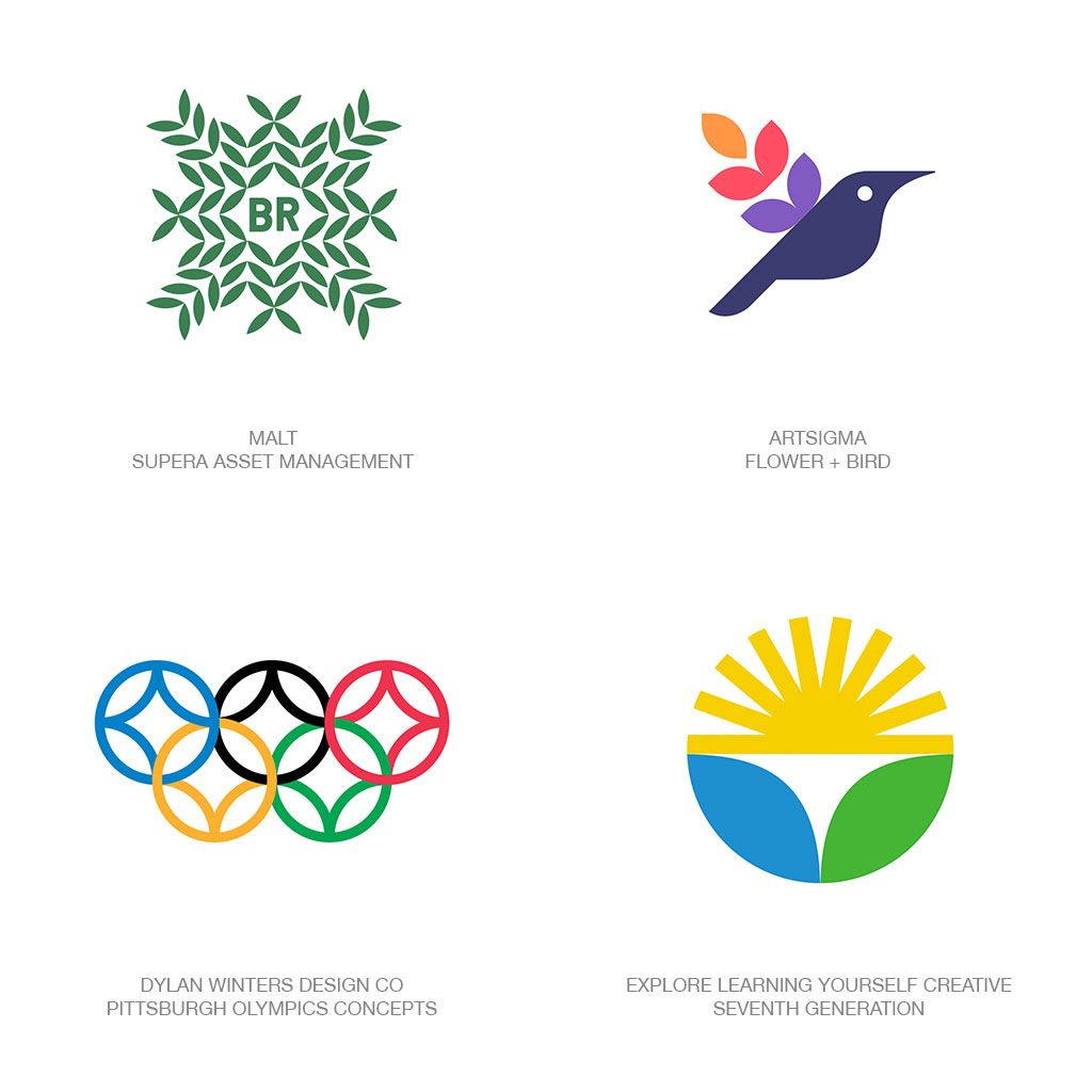
Trend: Almonds
“Because the official names for this shape are pretty sketchy, we’ll refer to it as an almond. Apropos, since this organic icon has time and again played the role of leaves, eyes, lemons, limes, fish, feathers, petals, seeds, and a multitude of other natural nuggets.”
Our Take:
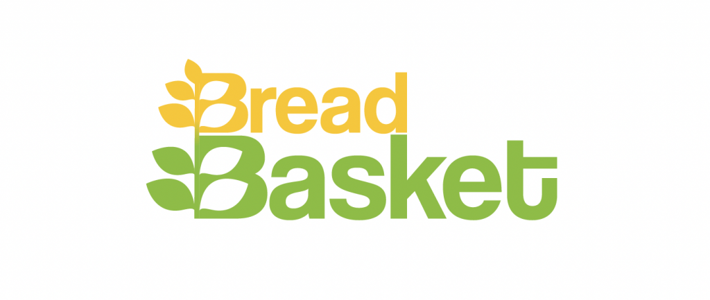
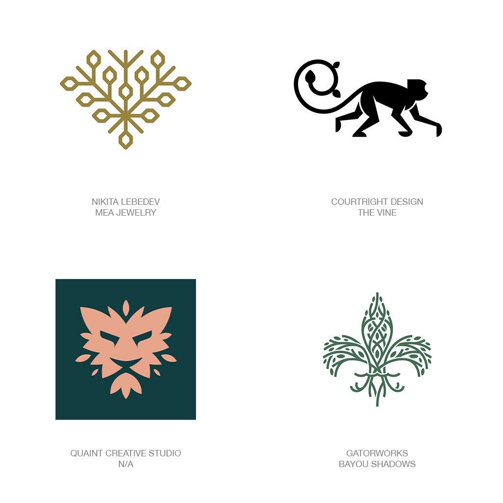
Trend: Trellis
“Much like a trellis, in the shape of a fleur-de-lis, still represents all things French, or royal, it also may be a signal of growth or nature. All this leafiness is not about the leaf, it is about the symbolic foundation icon that may be furled in green.”
Our Take:
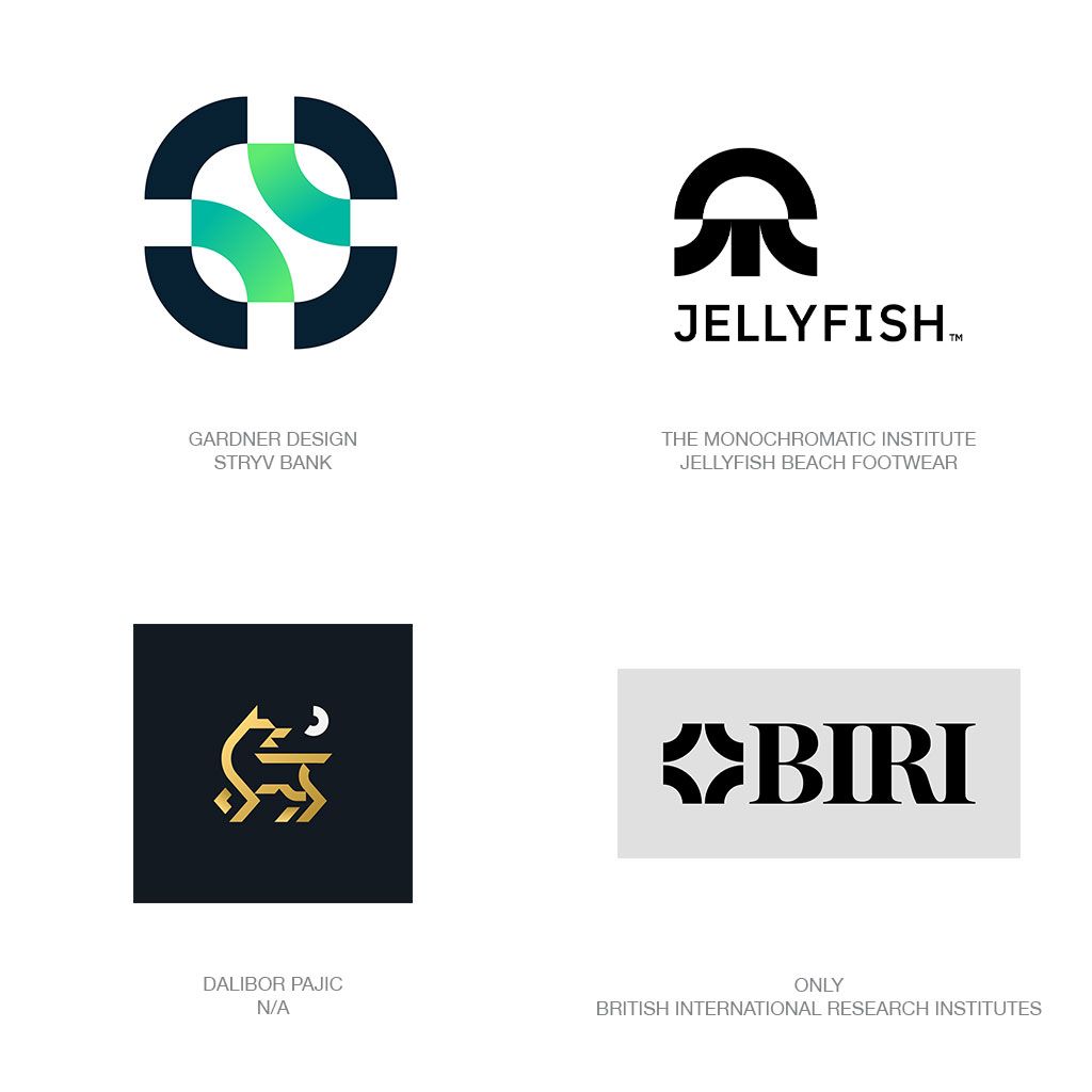
Trend: Macaroni
“To my surprise there’s no geometric name given to this shape but whether in a half or quarter circle configuration the survey this year churned up enough Macaroni based logos to feed a small nation. Yes, this is the second shape of the year as referenced under the Almond trend.“
Our Take:
